New England Comics
A complete makeover of a local business’ E-Commerce website with a focus on the check-out process and site navigation.
Project Brief
The goal of this project was to find a local business with an E-Commerce website that was in need of a redesign both aesthetically and functionally.
My Role
This was an individual project for me. I choose this site because as a kid this was one of my favorite stores. I would ride my bike to browse comics all the time. Unfortunately, the website is a mess. The site is hard to navigate, has an outdated and unappealing design, and doesn’t allow the user to search and/or purchase much of their current inventory.
Role
UX/UI Researcher & Designer
Data Analyst
Tools
Sketch
Miro
Zoom Interviews
Adobe Photoshop
Adobe Illustrator
Release Date
October 2020
3-Week Sprint
Phase 0: Project Dynamics
Team Dynamics
In a previous project, I made the mistake of creating a solution before I gathered enough information to know what the real problems were. I wasn’t going to make the same mistake on this project. I made sure to gather plenty of information on how best to improve New England Comics’ website.
Phase 1: Discover
Click the Image to See a Larger Version
competitive analysis
I started with a Competitive Analysis comparing NEC with three other online comic book retailers.
All of the other e-commerce sites I explored had more dynamic designs and were easier to navigate. Surprisingly, Comicology was the only checkout process that was easy to use.
These results helped me frame my questions for user research. I decided to focus on navigation and the checkout process.
User research
I conducted four user research interviews. The two male and two female participants were all in their mid-twenties to mid-thirties. Some of the questions included:
What was that experience like? What was good about it? What could be improved?
When you were looking at the item you were going to buy what information were you looking for about the product? What information is relevant to you whether you’re going to buy it or not?
When thinking about the navigation process is there anything that stands out to you about a former experience either positively or negatively navigating the site?
What about the checkout process? Why?
Is the navigation/checkout process important enough to you that it would deter you from using that website?
Lisa N. is a frequent buyer of comics online.
Phase 2: Define
Click the Image to See a Larger Version
Affinity Mapping
I used Miro to organize digital stickie notes and began creating a virtual affinity map. Affinity maps are incredibly valuable for synthesizing data. I grouped the responses and generated takeaways from the four interviews. Those takeaways allowed me to build a prototypical online comic book buyer.
All of the participants remarked on wanting to be able to find details (authors, artists, etc.) about the product as well as see pictures of the product they were buying. They also reported that they like being able to see where the comic book/graphic novel falls in the series chronology. They were very positive about user reviews of the products. They also like the ability to see what items they have already purchased so they don’t rebuy the same items again. Respondents were also in agreement in their dislike for complicated/confusing checkout processes. They mentioned wanting the site to remember their information from previous visits. They expressed a desire for a search with Autofill functionality that allows the users to sort/filter the results. Most importantly, users want an easy-to-use navigational system and checkout process.
Click the Image to See a Larger Version
User Journey Map
I created a journey map to help visualize the user responses. It depicts the positive and negative features the users have encountered as they browse, shop, and checkout on an e-commerce comic webpage.
Heuristic Analysis
Using a template for a heuristic analysis I combed though the site looking for strengths and weaknesses. It is important to note that the rating scale for the template is based on the severity of the problems encounter for a given category, so the greater the number score the more severe the issues found on the site for that category. A few of the more egregious issues I found while browsing the current site:
The layout and design aesthetic are awful. There is no obvious rhyme or reason to design of the current site. I explored the site for hours and still could not consistently reproduce results. The main home page lets you scroll significantly past where the content stops.
I went through most of the checkout process without ever submitting any payment information and it sent me an email thanking me for my purchase. A day later I got a phone call asking if I wanted to submit payment for the comics and where should they send them. There are also links that go straight to PayPal to purchase items, and some that take you to the NEC Amazon.com store.
There are many items that show the sale and regular purchase price as the same amount.
Not the most significant problem by any means, but I found this shocking bit of text on the help page:
"To contact NEC via email please use your email client to send a message to
NEC Support at newenglandcomics.com
Remove all spaces and replace "at" with "@". Note that to avoid spam NEC only accepts "plain text" messages at this address (no html in message.)"
Click the Image to See a Larger Version
Click the Image to See a Larger Version
Persona
The information gathered from the user research and the affinity map helped generate the persona of MaryJane Parker to serve as an archetype to validate my design choices as the project progressed.
Click the Image to See a Larger Version
Problem Statement
I used the user research to identify the major pain points for potential users, allowing me to formulate a problem statement:
“MJ the comic book reader needs an efficient and user-friendly way to find and buy comics online because she lives too far from an accessible brick and mortar store.”
Phase 3: Design
IDEATION
Informational Architecture
I started by outlining a navigational scheme that made sense. I looked at other online retailers and tried to adopt a more modern menu system.
Click the Image to See a Larger Version
The next step was outlining the current NEC site’s user flow. This was useful to try and make sense of what NEC was trying to do, and allowed me to try and create a user flow that was more intuitive. Next I took the navigational scheme and current user flow and used them to create a concept for how the redesigned site’s user flow would work.
Click the Image to See a Larger Version
Click the Image to See a Larger Version
Paper prototype
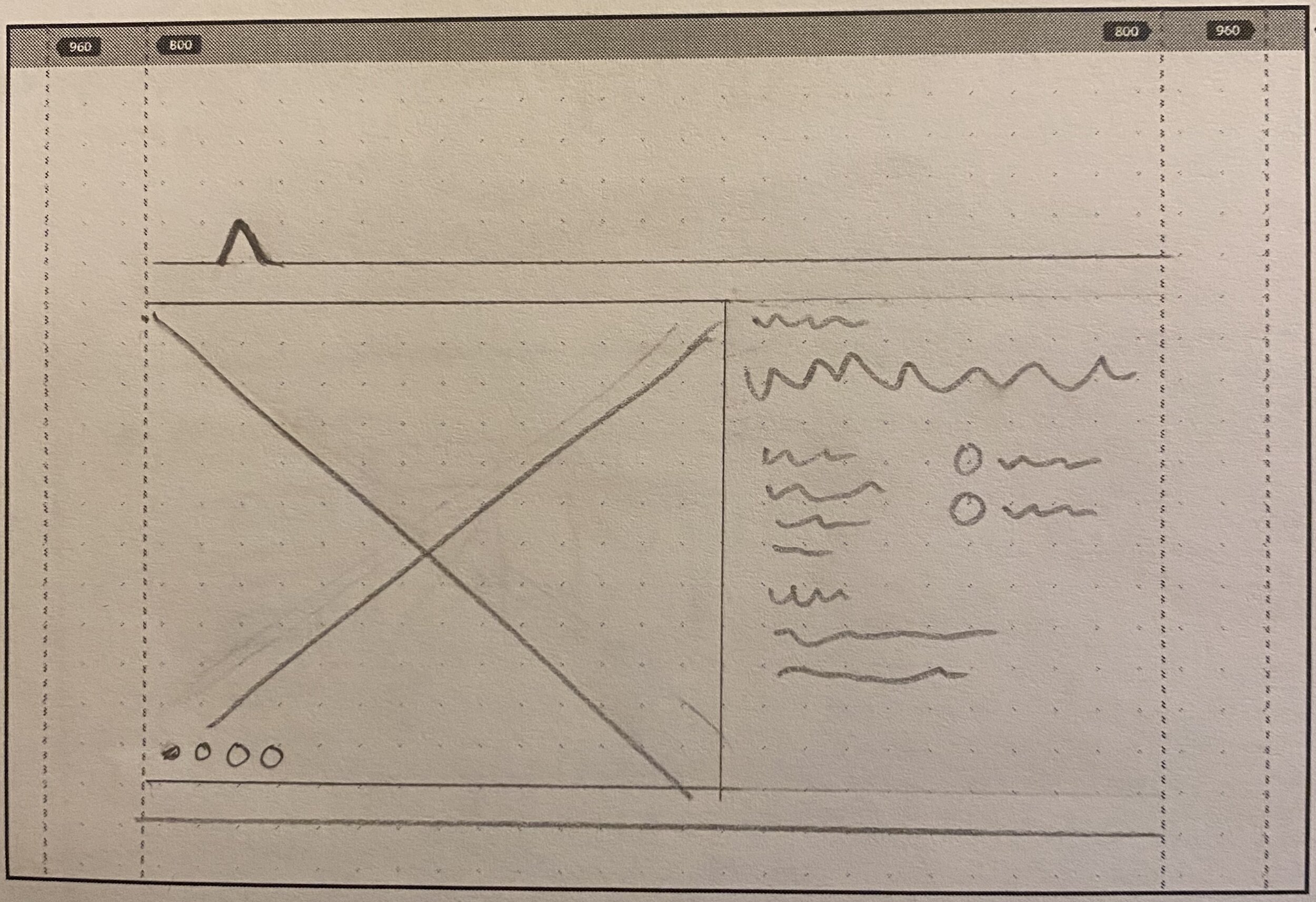
Once I had synthesized the information from the participants and my own exploration of the site I started sketching out the design for a paper prototype of the NEC website. I wanted to display a consistent and modern design. I want the users to be able to find products easily, and buy them easily. I explored several successful online retailers to get a feel for what worked and didn’t in a checkout process. I also wanted to provide users easy access to information about the products, store locations, and a functional search.


Click on an Image to See a Larger Version
LO-fi Prototypes
I created a mood board on for inspirations. I found some comic book art online and based the color scheme off of that. I wanted to implement a brand that spoke to the comic book consumer. The entire design only uses six colors (excluding comic art of course). I did not have access to a high quality version of the logo, so I made my own version.
The focus for all the prototypes and the project as a whole was to improve the shopping and checkout experience. For the Lo-Fi prototype I started with implementing bright colors from the mood board, but keeping the color scheme consistent and giving the design a more modern esthetic. The original design also was hard to navigate so I wanted the navigational system to be straight forward and user friendly. To that end, I created functional headers, a sub-menu of navigational links, and footers. The footers would provide users the ability to subscribe to the mailing list, search for products, and access NEC’s social media. I added hero images to the tops of pages to serve and navigational breadcrumbs and provide some pop to the pages. I also built in informational sections to the products so users could learn more about them before they bought them.
Phase 4: Deliver
Hi-Fi Prototype
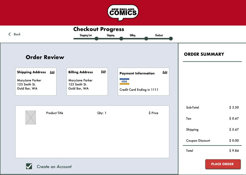
Utilizing Sketch I updated the Lo-Fi prototype into the Hi-Fi prototype. Implementing all the comic book art was time intensive, but it was one of the things that the research said that users really want. Small details can make the difference in whether an e-commerce site retains its customers. Comic books being such a visual medium it felt strange how little of the existing site showcased artist’s work.
Another piece of feedback I received from user testing the lo-fi prototype was to add a thank you page after the checkout process complete, so I created that page.
Click on an Image to See a Larger Version
Updated portfolio version
When I decided to add this project to my portfolio I decided the hi-fi prototype looked a little flat, so I went back in and made some improvements. From the very beginning of the project, I wanted to incorporate the old-school comic book texture into the header banner. I think it gave the banner much-needed depth. I also felt the fonts I had selected didn’t match the comic book brand I was trying to create for the site, so I found some that felt more like the typography that is found in comic books. I also added shadows to some of the header text to give them more contrast.
While making some small adjustments to the layout after switching fonts shifted the position of some of the elements I realized I hadn’t used as many symbols as a should have, so I replaced a lot of the page content with symbols that I could edit on en masse. I also redid the NEC logo I had made to make it a little cleaner. Also, one of the user testers for the hi-fi prototype suggested I remake the sale promo on the home page, so I took the original and just updated it to fit the brand more. The social media icons got upgraded.
Lastly, I updated the sub-nav menu to be more of a breadcrumb, by adding color to the link text that the user was currently on. I also got feedback from user testing that not everyone would know that the NEC icon was a link to the home page, so I added a home page link to the sub-nav menu bar.
You can find a clickable version of the prototype HERE or by clicking on the button to the left.
Next Steps & TakeAways
This project is probably finished for my purposes. However, I did learn an important takeaway from this project: the value of symbols. It was INCREDIBLY frustrating to have to go back in make so many small adjustments to this project because I didn’t use symbols from the start. Never again. It also gave me good practice constructing my own icons/designs on Adobe Photoshop and Illustrator.


