pataGO! Fitness App
Mobile fitness app for Patagonia brand featuring workouts designed to support outdoor sports enthusiasts and their fitness goals.
Project Brief
There has been a major increase in the amount of customers using mobile applications to easily access virtual workouts due to COVID-19 gym closures. You've been contracted by Patagonia to establish user needs and create a mobile prototype that allows users to attend live and on-demand fitness classes and interact with the online Patagonia community.
My Role
I worked on a team with three other designers. I contributed to all phases of design including: project planning, competitive analysis, ideation, affinity mapping, writing the problem statement and HMW’s, user flows, usability interviews, designed and conducted a card sort, prototype design, and presentation design.
Role
UI Designer
UX Researcher
Data Analyst
Tools
Figma
Miro
ClickUp
Google Drive
Optimal Workshop
Release Date
October 2020
2-Week Sprint
Phase 1: Discover
Click the image to see a Larger Version
competitive analysis
I looked at 5 of the most popular workout apps that are on the market. This helped us frame our questions for our user research. Most of the apps had similar features (recorded workout videos, progress/activity tracking, motivational and/or gamification features, etc.). Significantly, none of the apps have content directly designed for the outdoor sports enthusiast.
This made us feel like there was an opportunity for Patagonia to provide their community with something directed to their needs.
User research
Five user interviews were conducted. Some of the questions included
What types of exercise activities do you participate in? (Run, Hike, Yoga, etc.)
Have you ever used a workout application on your device? (Which one?) What was that experience like? (What stood out to you?)
How many classes have you taken? Were they live? Were they previously recorded?
How familiar are you with the athletic-wear company Patagonia? What comes to mind when you think of them? What do you know about their commitment to addressing environmental issues?
Phase 2: Define
Affinity Mapping
After reviewing the data provided by the 5 subjects we interviewed for user research, we were able to create a clearer picture of the thoughts and preferences of a typical workout app user. While the subjects exercised in different ways and had different goals for why they workout, we were able to identify some commonalities in what users look for/utilize in terms of "workout apps."
Participants identified that they wanted free, pre-recorded classes (not live), motivational features (including gamification and the ability to compete with friends), and a variety of workouts. Another conclusion from the interviews was Patagonia had 100% positive brand ID.
Persona
We used our research to create the persona of JB Youngman to serve as an archetype that we could use to validate our design choices as the project progressed.
Problem Statement
Our research also identified the major pain points of our users, allowing us to construct our problem statement:
“JB Youngman is an outdoor sports enthusiast who loves working out, but due to the recent limitations of Covid-19 many gyms have closed. JB needs a way he can continue training so that he can meet his fitness goals without going to a gym.”
Feature inventory
We utilized a feature inventory, based on our research and my competitive analysis to create prioritized list of features to include in our prototype.
Feature Inventory was very helpful in getting the team on the same page on what features we wanted to focus on.
Phase 3: Design
user flow
I created a user flow to help identify the screens and components we needed to design for the prototype.
Click the image to see a Larger Version
Card Sort
Using Optimal Workshop I designed and conducted a virtual closed card sort to help the rest of my group working on the prototype design have a better sense of what navigational structure might be more intuitive to the user’s expectations.
Prototyping & Usability Testing
We first virtually tested a paper/sketched version of the prototype using Invision over Zoom, and then made some adjustments and then built and virtually tested a mid-fi prototype using Figma.
I actually really enjoy interviewing people. It is fun to ask questions and get surprising answers. It is also very useful to get other people’s insights on the prototype you’re making. I have never done a round of usability testing where the subjects didn’t reveal something that had not occurred to me.
Phase 4: Deliver
Hi-Fi Prototype
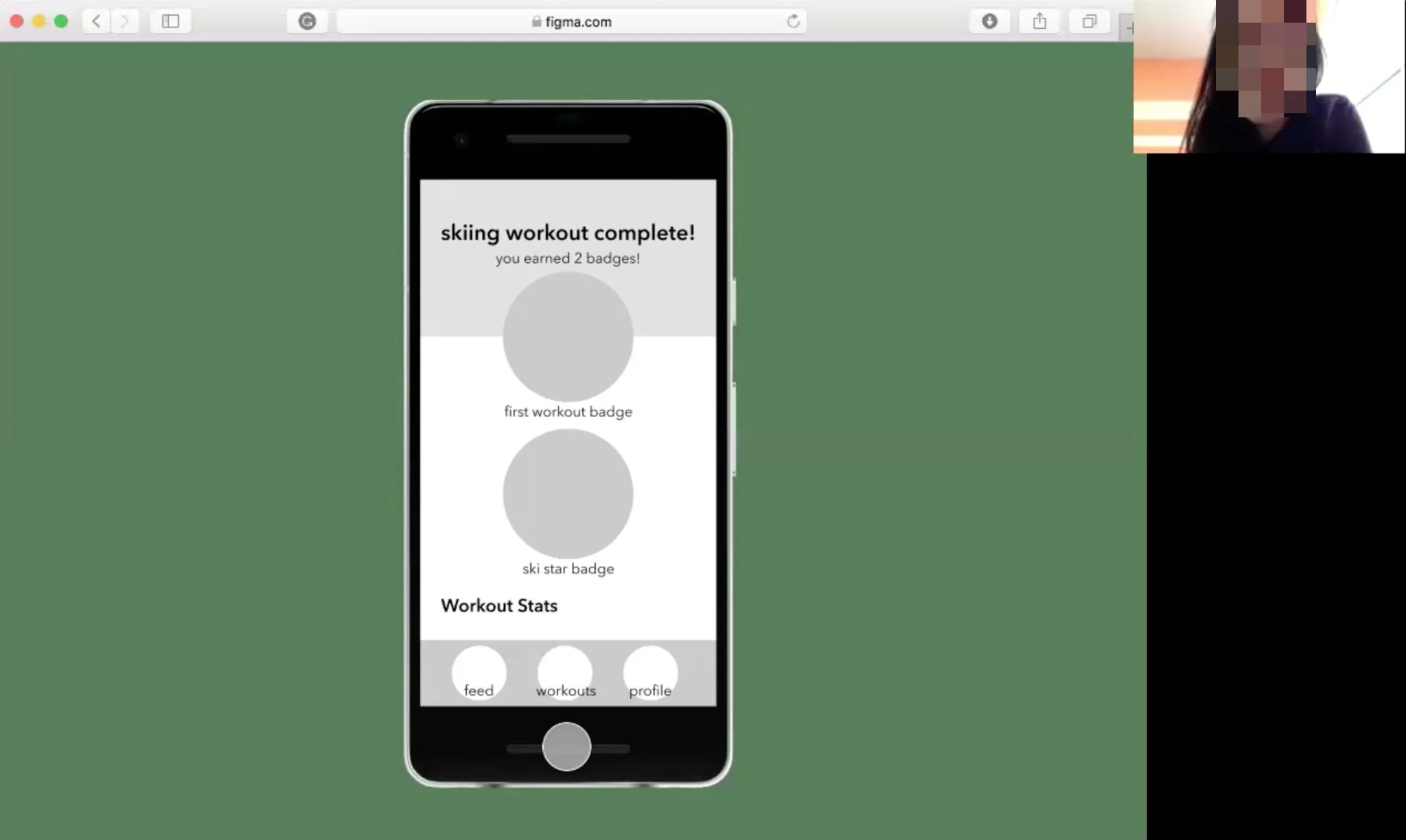
The hi-fi prototype was created on Figma for an early version of the Google Pixel phone, but I went back in on Sketch and changed it to a more current iPhone12.
In both versions I implemented a color scheme based on the colors from the Patagonia logo, and used the same fonts that existed on their website. I also curated the images in the app for both versions and created all the badges that would be used in the reward/gamification section.
You can find a clickable version of the prototype HERE or ⭆
Next Steps & Take Aways
It terms of the app itself there are still features to add (e.g., Social Features, Challenges, etc.). In addition there are animations that didn’t quite work that need to be fixed.
I main takeaways from working on this team project was mainly about working on a team with other designers and what technologies I like working with.
I always enjoy working on a team, but this was a level of collaboration was new, and it took some getting used to. It retrospect I would have either took more of a leadership or encouraged someone else to take on the project manager role. More defined roles, and some more leadership would have helped us be more productive.
I definitely can work on Figma, but prefer Sketch. I got to have some experience with Asana, Optimal Workshop, Canva, and Invision.


